The Look of the Games is the face and visual identity of the event. It’ll change aesthetically the competition and non-competition buildings, the airports, the Pan American and Parapan American Village, the satellite villages, the warm-up areas, among others. In summary, this visual identity will express the vision, essence, and tone that Santiago 2023 wants to transmit.
Santiago 2023 will be carried out in 21 districts from four regions. Therefore, the diverse venues of the Games will be unified by the same aesthetic: walls, signages, and publicity full of colors that will represent the spirit and atmosphere of a historic event for our country.
The special edition of the Santiago 2023 Look of the Games will be absolutely representative of the Chilean geographic territory. A color palette will be used to give life to the continental festival that will host 39 Pan American sports and 19 Parapan American sports; this will highlight the incredible performance of the athletes and Para athletes.
The inspiration?
The geographic diversity of our country! A country recognized worldwide for its beauty and rich diversity from Arica, in the north, to Punta Arenas, in the extreme south.
Considering this, the designers of Santiago 2023 were inspired by the most representative scenarios of the country: the Torres del Paine; the majestic Cordillera de los Andes; the Santiago city including the San Cristóbal hill; the Atacama desert and the condor, that symbolizes strength and is in the Chilean national shield; the millenary araucarias, that are so important for the Mapuche culture, and finally the clean skies of the Chilean north.

“More representative graphic icons of the country were created in order to achieve a territorial rescue that integrates diversity, geographic resources, and a color palette of the territory that coherently lives with our logo and slogan,” indicated Verónica Lobos, head of Brand, Identity and Look of the Games.
This new creation referred to by Lobos is called supergraphic, which was created with a color palette that will enhance each space, sports venue, discipline and, of course, each of the nearly nine thousand athletes and Para athletes who will visit our country in October and November of this year.
"Based on a study conducted by Marca Chile on ‘The pride in being Chilean,’ we can say that the territory factor and our mountain range is what represents us the most and what we’re proud of the most," she emphasized.
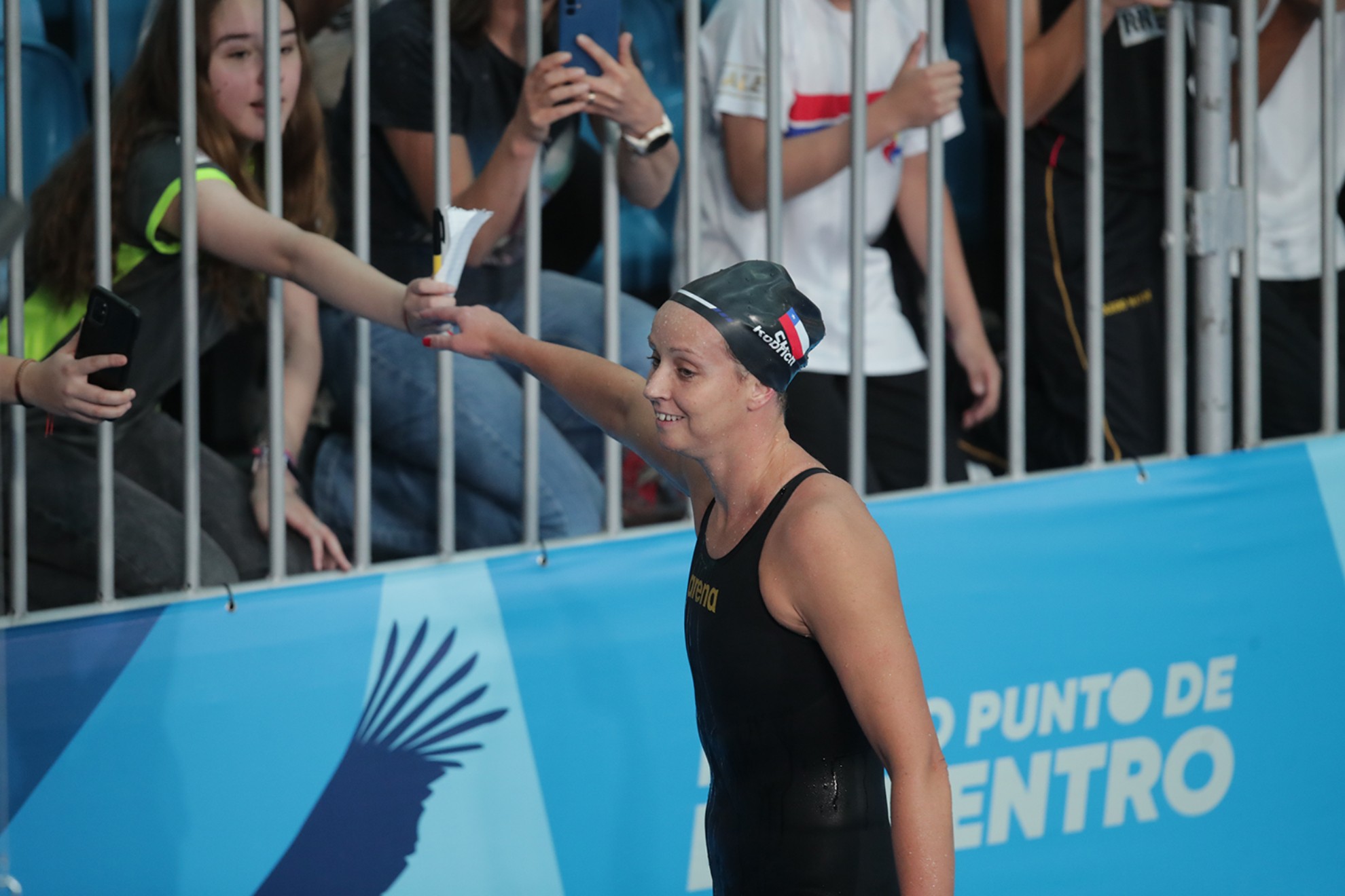
You’ll also be able to watch this through our digital channels, official store, tickets, medals, torch, subprograms, uniforms, podiums, ceremony elements, diplomas, participation certificates, publicity in the city, and more.
Santiago 2023 promises to be a first class show in all senses and its graphic identity won’t stay behind.
Come and live this sport festival with us and don’t miss details about what will be the most important event in the history of our country!
Pan American Games from October 20th to November 5th, 2023.
Parapan American Games between November 17th and 26th, 2023.
SANTIAGO 2023
Correo: comunicaciones@
Instagram: @
Instagram Mascota: @fiusantiago2023
Twitter: @santiago2023
Facebook: /Santiago2023oficial
Youtube: @Santiago2023oficial
TikTok: @Santiago2023oficial
Flickr: @Santiago2023
#LegadoSantiago2023
#Santiago2023Legacy